Content
Recent Posts
BMW Quietly Updates Its Iconic Logo


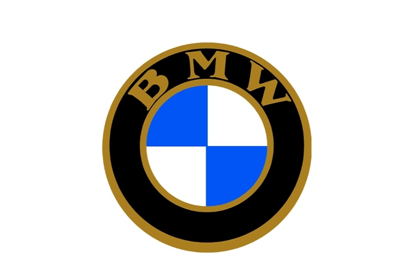
BMW has made a change to one of the most recognizable logos in the automotive world. The update is subtle, almost invisible unless you know exactly what to look for. It first appeared on the upcoming 2027 BMW iX3 and will roll out across BMW’s lineup as the brand enters its next design phase.
At a glance, the logo looks the same. The circular shape is still there. The blue and white quadrants remain untouched. The BMW lettering stays in place. But closer inspection shows a shift in finish, texture, and detail that reflects where the brand is heading.
BMW did not announce the change with a major campaign. There was no dramatic reveal or rebrand statement. Instead, the updated roundel surfaced naturally alongside the debut of the iX3, a model that represents BMW’s Neue Klasse direction for electric vehicles. That quiet rollout says a lot about the intent behind the change.
Content
What Exactly Changed in the BMW Logo
The biggest difference is the removal of the inner chrome crossbars that used to separate the blue and white sections. Those metallic dividers gave the badge a more three dimensional look. They are now gone.
The black outer ring has also changed. It uses a satin style finish instead of the glossy black BMW has relied on for years. The chrome edge around the badge remains, but it appears darker and more restrained. The BMW lettering looks slightly slimmer and more refined, though the font itself is unchanged.
None of these changes alter the logo’s shape or meaning. They refine it. BMW is not trying to reinvent its identity. It is tightening it.
The new badge will appear on future models, including electric and combustion vehicles. BMW’s M branding will follow the same design approach, keeping performance models visually connected to the core lineup.
Why Did BMW Change the Logo When the Difference Is So Small
The subtlety is the point. BMW has been shifting toward flatter, cleaner branding for years, especially in digital spaces. In 2020, the company introduced a flat logo for apps, websites, and marketing material while keeping the older metallic badge on cars. The new physical logo brings those two worlds closer together.
Modern vehicles live on screens as much as they do on roads. Logos need to look sharp on dashboards, mobile apps, websites, and software interfaces. Heavy chrome and deep shadows do not translate well in those environments.
There is also a brand trust factor. BMW has more than a century of history tied to that roundel. A dramatic redesign risks alienating loyal customers. A careful evolution keeps the logo familiar while signaling progress.
The update also reflects BMW’s approach to electrification. Instead of separating EVs into a distinct visual identity, BMW is folding them into the main brand. The logo does not shout “electric.” It quietly says this is still BMW.
BMW Logo History & Why the Roundel Matters
BMW’s logo dates back to 1917, when the company transitioned from aircraft engines to automobiles. The blue and white quadrants reflect the colors of Bavaria, BMW’s home region in Germany. Over time, the logo became associated with precision engineering, performance, and premium design.
Despite a long-standing myth, the logo was not originally meant to represent a spinning airplane propeller. That interpretation came later through advertising. The core identity has always been regional pride paired with technical confidence.
Across decades, BMW adjusted materials, finishes, and depth, but never abandoned the basic design. Gold lettering gave way to chrome. Flat paint turned into sculpted metal. Each update followed the same rule. Evolve, do not replace.
The latest logo follows that tradition. It modernizes the badge for today’s digital and electric future without breaking the visual link to BMW’s past.
Most drivers will not notice the difference right away. But that is exactly why BMW believes it got the update right.
For more industry updates, visit our automotive news section.