Is Walmart's Refreshed Look Enough to Stay Ahead in Retail?

In January 2025, Walmart unveiled a refreshed brand identity to bridge its storied past with its future as a people-led, tech-powered omnichannel retailer. The changes, while subtle, have profound implications for the company's positioning in an ever-evolving retail landscape. From modernized typography to an enhanced color palette, Walmart’s rebranding is a case study of how even slight updates can carry significant weight—when executed with precision and purpose.
Walmart didn’t reinvent the wheel, but every detail of this refresh was intentional. The most noticeable update is the wordmark. It now uses a custom font called Everyday Sans, inspired by Sam Walton’s classic trucker hat. This font isn’t just a typeface; it’s a bridge to the company’s past, subtly reminding customers of Walmart’s heritage while looking ahead to its future. The result is a clean, modern look that feels approachable but confident.

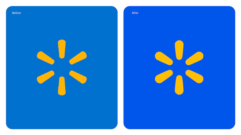
Then there’s the iconic spark logo. While still the familiar sunburst symbol tied to Walmart’s identity, it’s now being positioned as a standalone brand emblem. Like Target’s bullseye or Apple’s apple, the refreshed spark has been made thicker and more organic, emphasizing its role as a distinct, recognizable symbol. Walmart’s goal is clear: to ensure the spark becomes synonymous with the brand, even without the word “Walmart” accompanying it.
The color palette also got a refresh. The new “True Blue” is vibrant and warm, paired with “Spark Yellow” to inject energy and positivity. Walmart also introduced complementary tones like “Bentonville Blue” and “Sky Blue” to add depth and flexibility, creating a consistent visual language across its website, app, and stores.
Even in-store design has been reimagined. Full-color murals now add personality and storytelling to Walmart’s spaces, replacing the more functional, minimalist designs of the past. These changes aim to make shopping feel warmer and more inviting, aligning with Walmart’s shift toward being a more customer-centric and culturally relevant brand.

At first glance, Walmart’s updates might seem minor, but they reflect a careful strategy to stay relevant in a shifting retail landscape. These changes focus on evolution rather than reinvention, which can be a smart move for a brand with Walmart’s scale and history.
- Refining, not reinventing: Walmart’s core identity—affordable prices and accessibility—still resonates with customers. Instead of a dramatic rebrand, the updates subtly modernize the brand, allowing Walmart to grow without straying from what its audience expects
- Bridging digital and physical: The refreshed branding brings a more consistent look across Walmart’s stores, website, and app. This continuity helps solidify Walmart’s position as a reliable omnichannel retailer, though it doesn’t break new ground in the industry
- A familiar but fresh look: The tweaks aim to make Walmart more visually appealing and culturally relevant. The approachable tone and brighter visuals suggest a nod to diverse communities and evolving customer preferences, but these changes feel more like a safe step forward than a bold reimagining
But subtlety has drawbacks. Some customers might not notice the changes at all, potentially undermining Walmart's effort in the refresh. While this strategy may be effective for an established brand, smaller or struggling businesses may fall short if they don't take the necessary risks to attract attention.

Walmart’s refresh offers a masterclass in branding strategy. Small, meaningful updates for some brands can reinforce identity and keep you relevant without alienating loyal customers. Walmart’s balance of modern touches and nostalgic nods shows how to evolve thoughtfully.
But here’s the catch: not every business can take this approach. If your brand struggles to connect with customers or feels misaligned with your values, you might need a more dramatic shift.
Think of a complete rebrand as hitting the reset button—necessary when your message isn’t landing with your audience.
For newer or smaller brands, subtlety can sometimes backfire. You need to make enough noise to be noticed, and that might mean a bold new logo, a fresh color palette, or even a total overhaul of how your brand looks and feels. The key is knowing your audience and staying true to your vision.
Walmart’s brand refresh reminds us that change doesn’t always have to be loud to make an impact. It’s about listening to your customers, understanding your brand’s core values, and making thoughtful, authentic updates.
For businesses, the takeaway is clear: whether you go bold or keep it subtle, your rebranding efforts must reflect who you are and where you’re going. Walmart’s story proves that even the smallest changes can spark meaningful conversations—so long as they’re done with purpose.